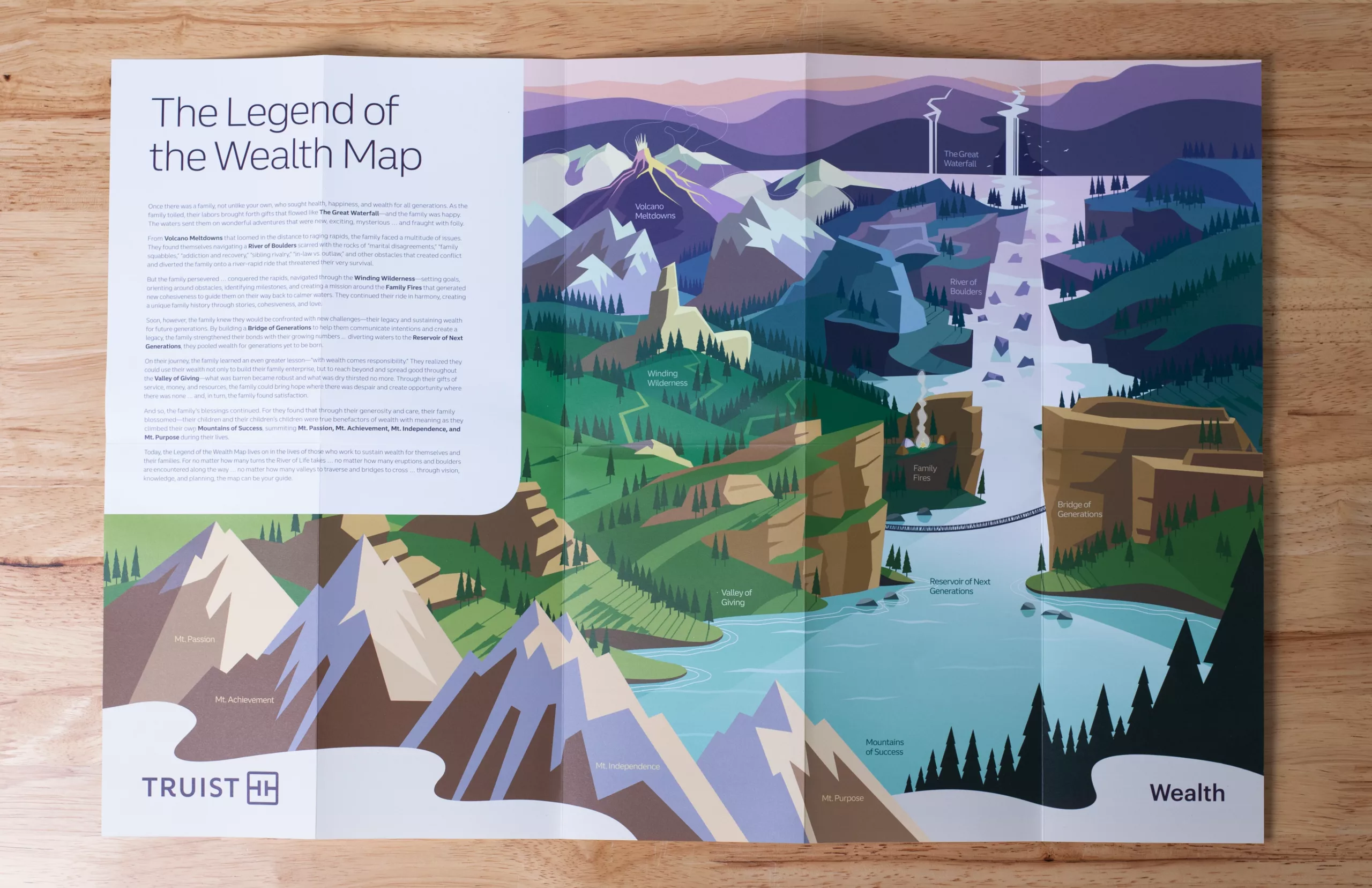
The illustration style chosen was minimal and geometric, favoring good design practices over complexity. While complex details are the traditional appeal of illustration work, this style’s brilliance shines through the use of space, geometry, lines, and angles.

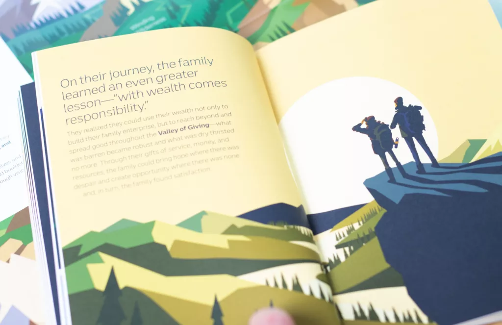
We were intentional about the vantage point when developing the illustration compositions. Creating a variety of vantage points within the illustration library ensured a more interesting and dynamic viewing experience across each piece we developed.
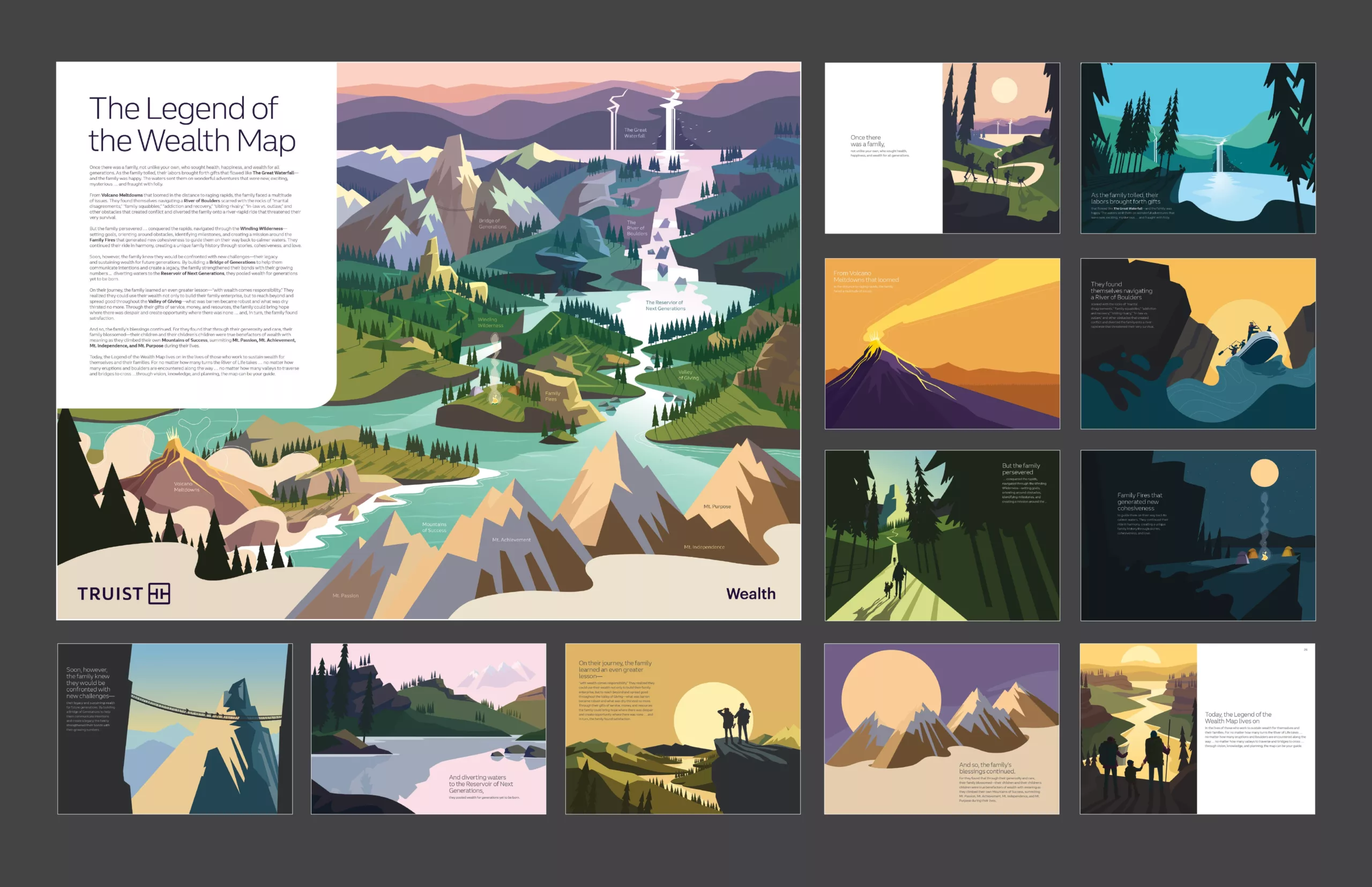
Color palettes varied across illustrations. This allowed us to create a range of warm scenes, cool scenes, and neutral scenes. To complement the Truist brand, each illustration was anchored by at least one Truist brand color.

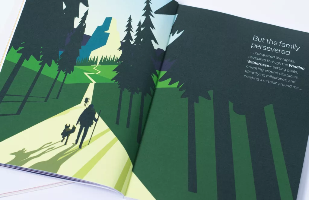
Subjects like humans, animals, and objects were used with deliberate simplicity to fit the overall composition. Using simple shapes and coloring to create our human subjects allowed us to represent a wide range of demographics within our illustrations.