Clarksburg Cider was a brand-new name in the beverage industry with a homegrown story to tell and a delicious product to back it up. They needed distinctive labels that not only embodied their brand but stood out in a market full of competitors.
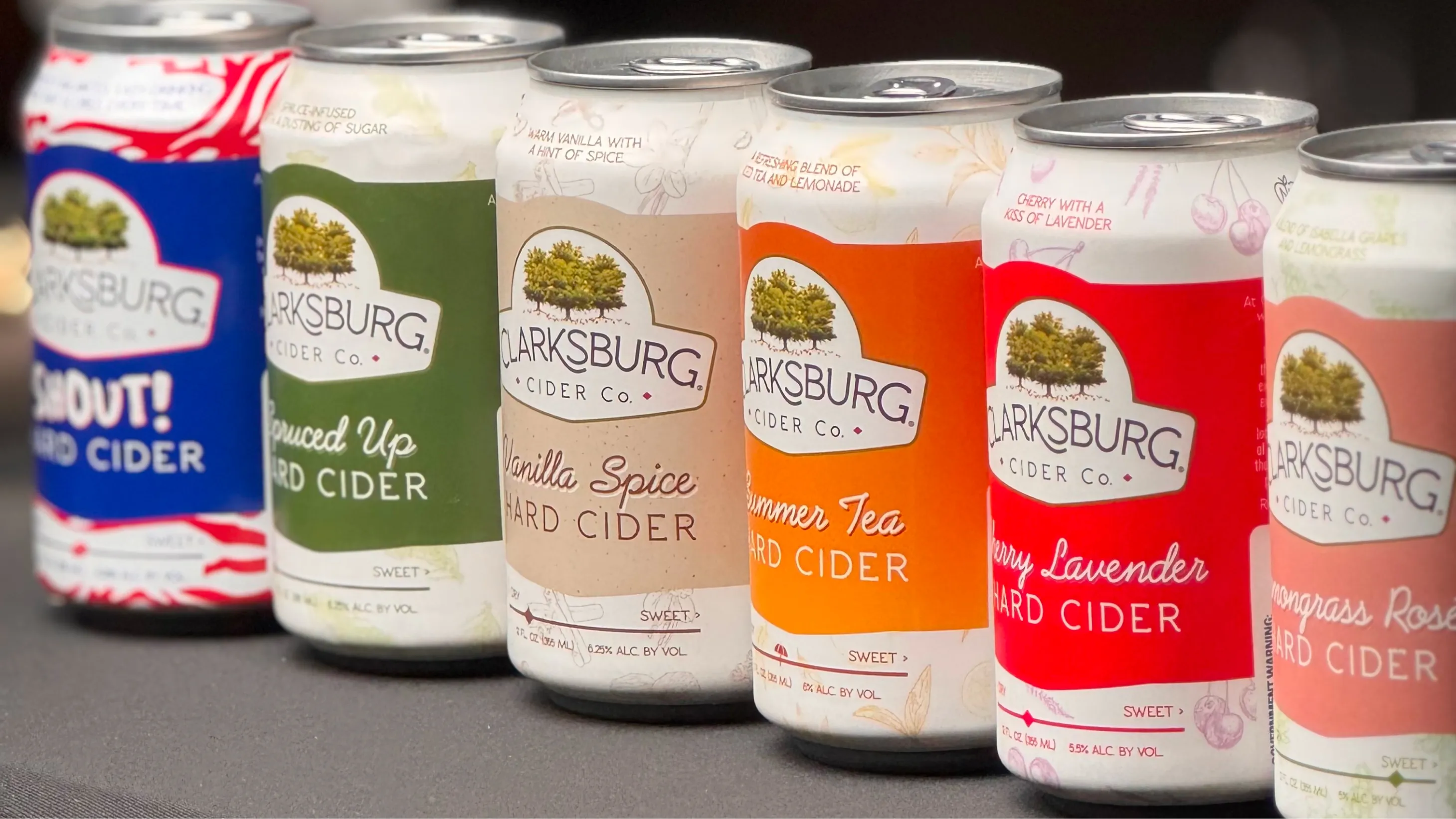
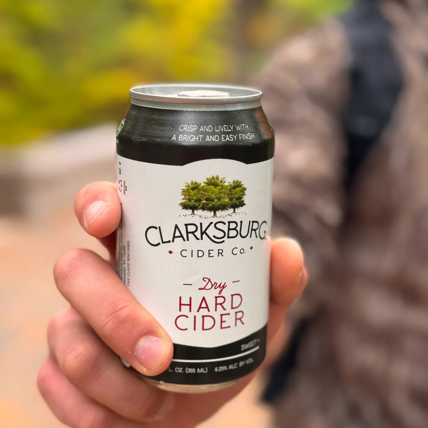
We designed cans that popped off the shelf. The core flavors sported a consistent, recognizable design with a large white background to help catch consumers’ eyes.
But the brilliance is in the details—all of which give the product a handcrafted feel. The design is hand-drawn. The trees come from a painting commissioned by Clarksburg’s founder to commemorate the cidery’s launch. Clarksburg’s story is tucked cozily onto the side panel. And, there’s even a sweetness scale on every label for simple, at-a-glance flavor info.
The label was built to shift and evolve for seasonal flavors as well. We flipped the color bands, transforming the white space into a color that represents the seasonal flavor, and added various illustrations that tie to specific ingredients.
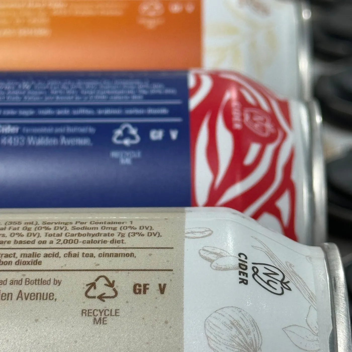
We did it all while working around national and state-level rules and regulations to make sure we met legal requirements for labeling.
Clarksburg became an established, recognizable brand that people remember for its unique look and feel. The system we built was easily scalable and allowed Clarksburg to maintain consistency across the shelf.