In a nutshell: Data visualization is a key way to improve performance. But what does it actually entail? Keep reading to learn more about what it is and the benefits it can bring to your team (as well as some ideas for getting started).
I’m just going to get this out of the way right now – I love data. You’re probably thinking, duh, you wrote this article. But if college taught me anything, it’s that you can write about a lot of things you don’t care about just to get the job done.
Rest assured; this isn’t an assignment from my supervisor to get a passing grade at my job. This is the extra credit piece I requested because of how jazzed I am to talk about data visualization.
See, when you visualize your data, you get a better understanding of how your site, campaigns, ads, etc. are performing. With these insights, you are better set up to make performance improvements the can optimize your work.
But, I’m getting ahead of myself. Let’s start with the basics.
What is data visualization?
This is one of those terms that describes itself. Data visualization is visualizing data (I can hear my seventh-grade English teacher telling me you can’t use the word in the definition). But I’ll give you a little more: Data visualization is using graphics to display information in an easily digestible way.
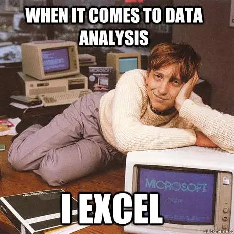
Instead of showing someone an Excel spreadsheet that only makes sense to your brain, you can use charts and infographics to communicate patterns and trends in the data.
(Me explaining my data findings from a complicated spreadsheet even I don’t understand.)
While technology has amplified the opportunities, data visualization has been around basically forever. The first known use happened back in 1160 B.C. The pie chart came around during the 1800s. Then, the early 1900s saw the first cases of data visualization being used in textbooks and for business, boosting its popularity even as statisticians were moving away from the practice.
Why all the history? Because I love the opportunity to combine two of my favorite things (history and data) in the process of making a point.
The urge to visualize our data goes back centuries for a reason. As humans, we want to understand things. We’re able to do this better when the information is presented to us in the simplest way possible.
While I’m writing this from a marketing perspective, data visualization is a practice that nearly every profession can and should use.
Now that we know what it is, let’s talk about the benefits of data visualization.
Automation
To be clear, you can visualize data from Excel. Game respect game, no disrespect here. But that involves more work and management in both organization and presentation. In today’s world of technology, there are many tools to help you create and automate data visualizations.
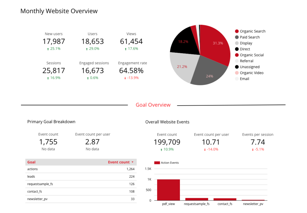
Instead of creating a report presentation outlining the performance of last quarter, you can create a dashboard populated by the charts you need, pulling data from the source(s). A date range control can be added, allowing you to view just the last quarter or any other range you want.
After the initial dashboard creation, you can use it as an ongoing resource instead of pulling data and building your charts every time. The time saved can be used for what’s even more important than just viewing the data: analysis.
Insights
Successful marketing is built on data-driven decisions, which come from insights. Looking at traffic acquisition over a month can give you a glimpse, but it’s never the full story. A data visualization dashboard designed to pull your most important metrics provides a high-level look at performance.
By reviewing your dashboard, you can identify trends or changes that require a more in-depth look instead of doing an initial review and then diving deeper, making your work more focused. You may also find trends that surprise you.
As an example, we’ve recently been creating automated dashboards with charts that align with specific client needs and campaigns. This process allowed us to uncover insights that weren’t the goal of the visualization but helped us learn about product performance and relay the results back to our client.
Another report allowed us to pinpoint where an event wasn’t recording as it should, enabling us to dive in and fix the problem.
Plus, the ability to share a dashboard lets all team members give their feedback and helps everyone understand performance better since each member will bring a different context and perspective.
Which leads to the next benefit.
Convenience
No longer is everything in your head—or the wildly chaotic spreadsheet. These automated dashboards provide a way for everyone to see the data.
Instead of relying on your data person to pull what you need or assemble a report, you can reference the dashboard with your automatically updated data. This means everyone has access to analyze performance at every step of the process.
You don’t need to be an expert at data, either, since the visualizations make it easy to digest and find trends. This gives everyone a hand in making sure performance is where it needs to be and provides to chance to pivot if it’s not.
Adjustment
As a marketer, understanding performance is crucial; especially when so much of our work can be modified mid-campaign. The work is never set, forget, and analyze at the end.
Data visualizations allow us to monitor performance on an ongoing basis and make a change when something isn’t working. We can follow best practices and optimize everything, but that doesn’t guarantee success. The best we can hope for is learning from the data and being flexible along the way.
A dashboard can be built to pull in multiple data sources and specifically monitor your KPIs. Instead of checking everywhere individually, you have a one-stop place to get an overview of performance so you can make informed decisions.
Even better, some services allow you to schedule reports and have automated emails sent out so everyone can stay up to date.
Who doesn’t love data in their inbox?
How to leverage data visualization
Too often, we look at data from the reporting perspective, typically at the end of a campaign. While evaluating performance is important, data should find its way into every conversation we have as marketers.
Data-driven decisions, remember?
These decisions should be made at every point of the process, from strategy to execution to monitoring to reviewing. With data visualization dashboards, we have this information readily available to use at every point of the conversation.
With informed decisions, we do better work and see improved results.
Getting started with data visualizations
To wrap up, I want you to know how accessible data visualizations are. If you search the term, you’ll see a lot of companies offering to help and mentions of “Big Data.” There is a time and a place for those things, but creating a dashboard is also something you can handle on your own.
Yes, you.
If you want to dive in, I’d recommend starting small. You can use Looker (formerly Google Data Studio) and connect your Google Analytics account. These are both free services and allow you to get comfortable with the basics.
A good starting point is to look at a previously assembled report and try to recreate it. From there, start to play around and see what else you can do. Soon, I’m positive you’ll feel confident enough to add more data and expand your reports into the data visualizations of your dreams.
But, if you want more help, we’re here for you. Just reach out to us and let us know.