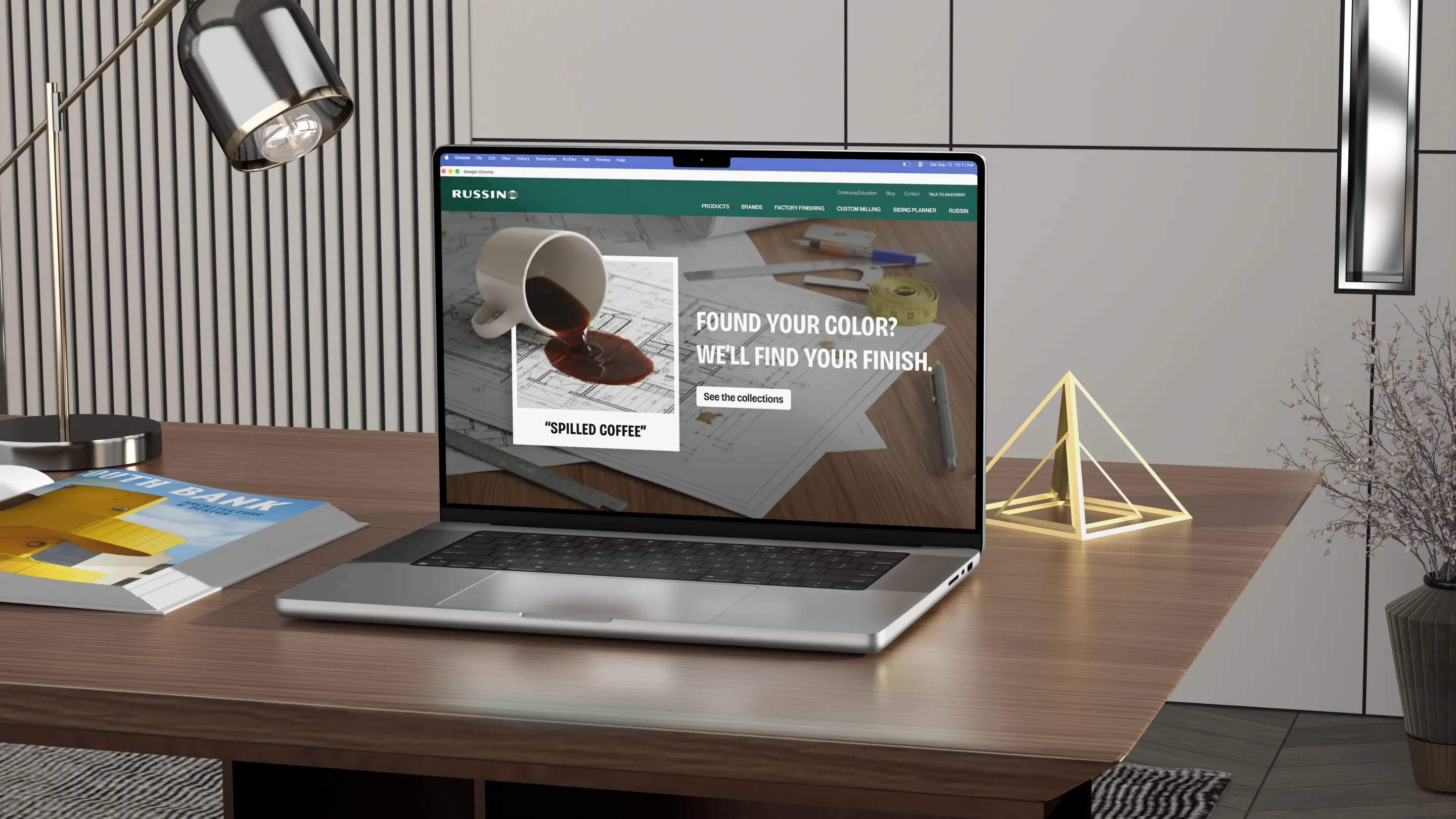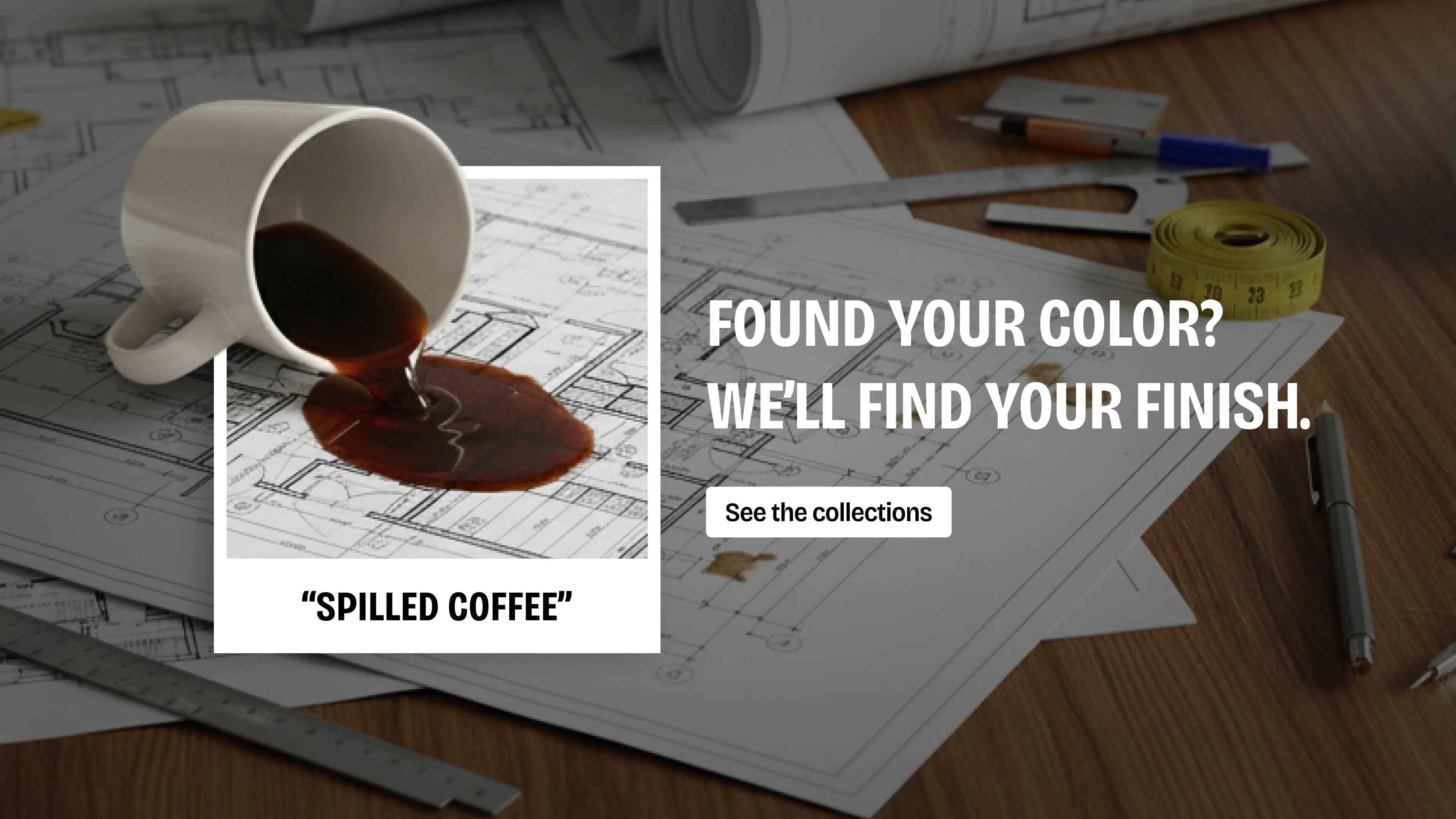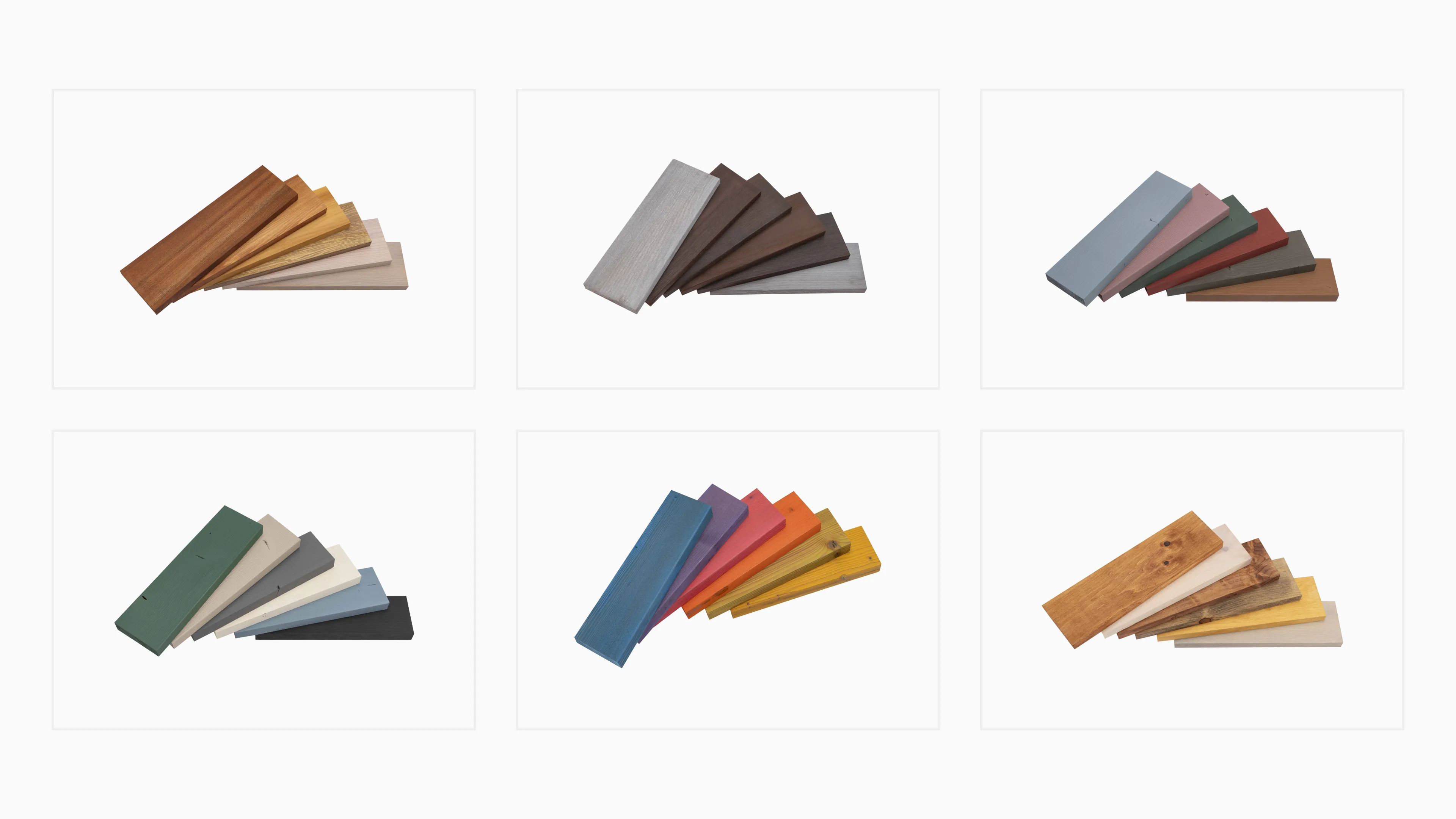
Architects and design professionals may not know the exact color they’re looking for until they spot it in the wild. The problem is that most wood distributors offer limited options for paints and stains. And every time customers need to settle for anything less than their original choice, they’re pulled one step further from their dream vision. But Russin can match any color. They just needed a creative way to say it.
To exaggerate the types of colors you can’t find in a swatch book, we came up with names like “popsicle tongue,” “sauce splatter,” and other playful shades to highlight Russin’s limitless range of finishing options. Then, we framed the unique visuals to look like a traditional color swatch to grab attention and drive prospects to find out more. The campaign ran across digital ads, social, and a dedicated landing page—standing out in a space that rarely takes creative risks. And the leads followed.
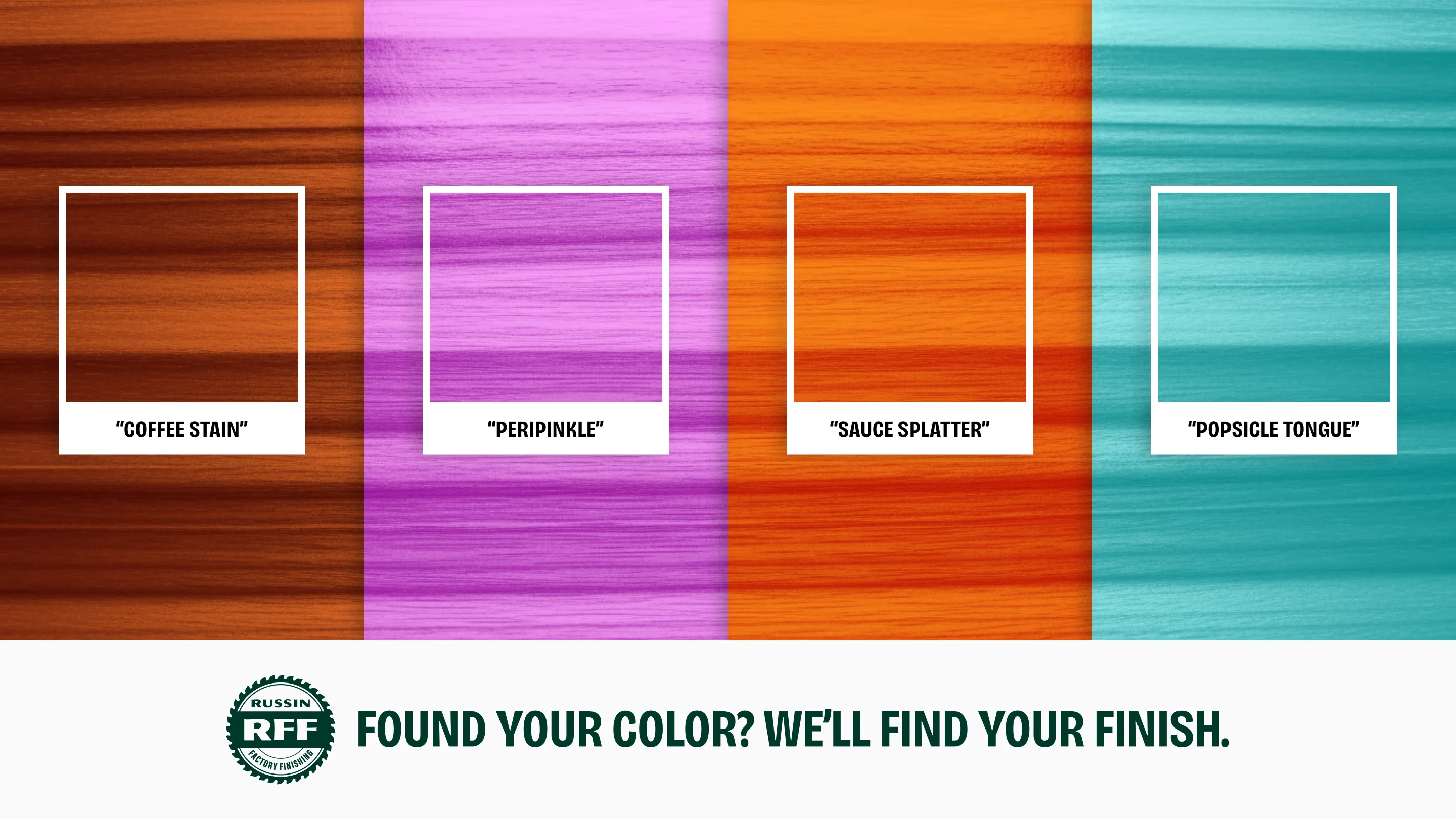



Our inbound lead goal was ambitious, but we exceeded it by 36% in the first phase of the campaign. One customer even asked for “sauce splatter” by name. Turns out, going against what everyone else is doing pays off.